Blitz News Digest
Stay updated with the latest trends and insights.
Why Your Website Looks Like It's Stuck in 1999
Is your website giving off retro vibes? Discover why it looks outdated and how to bring it into the modern era with simple fixes!
Is Your Website Outdated? Signs It's Stuck in 1999
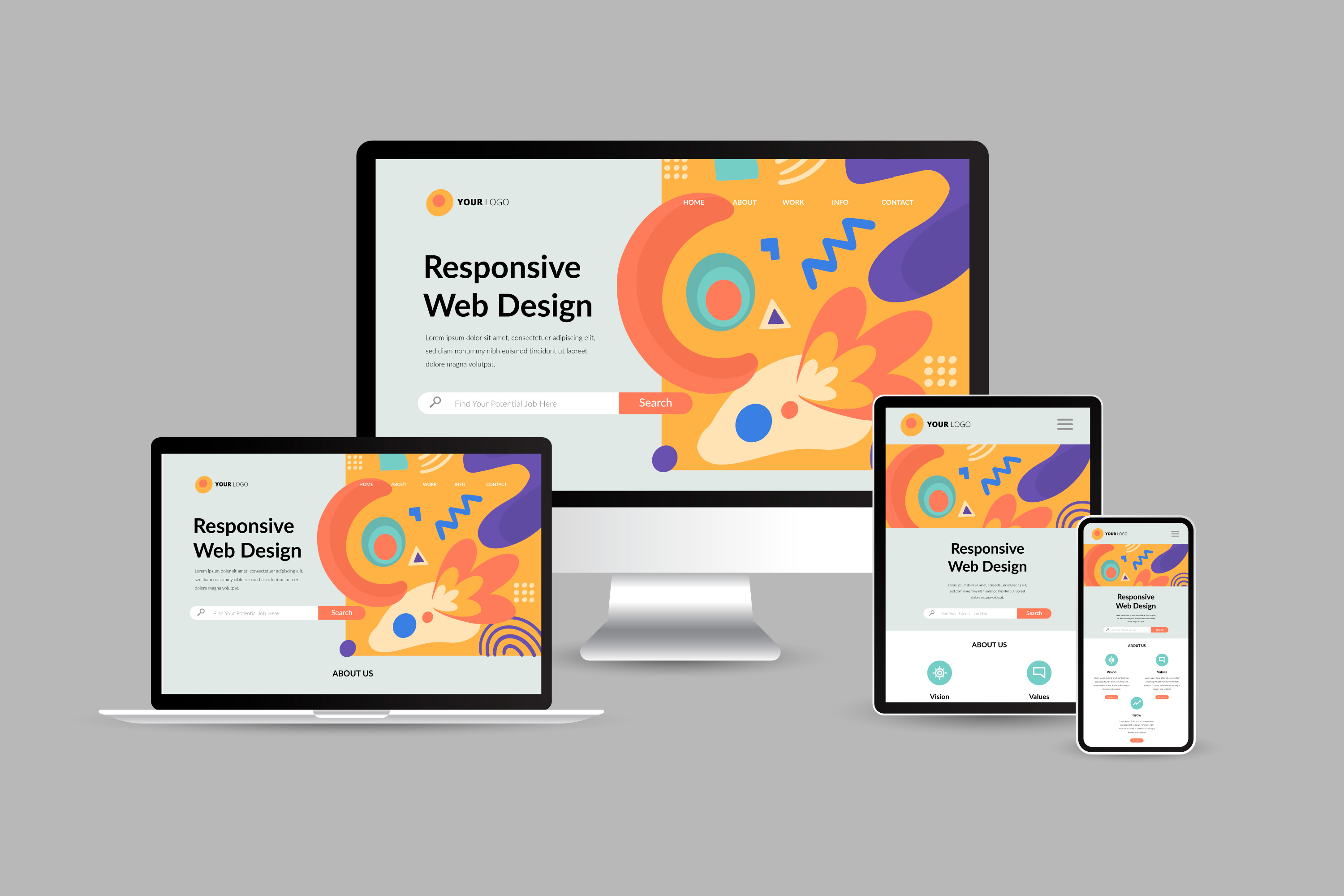
In today's digital landscape, having an outdated website can severely hinder your online presence. The first sign that your website is stuck in 1999 is a lack of mobile responsiveness. With over half of web traffic coming from mobile devices, a website that doesn't adapt to various screen sizes is not only frustrating for users but can also lead to a significant drop in traffic. Additionally, if your website still employs simple HTML tables for layout or relies heavily on Flash animations, it's time for an upgrade. Modern web design principles prioritize clean and adaptive layouts that enhance user experience.
Another telling sign of an outdated website is slow loading times. In the fast-paced online world, if your site takes more than three seconds to load, you're likely losing potential visitors. Outdated technologies, excessive use of large images, and unnecessary scripts can all contribute to sluggish performance. Furthermore, if your website stil features a dated color scheme or cluttered design elements reminiscent of the late '90s, you're missing out on the visual appeal that contemporary users seek. By recognizing these signs, you can take the necessary steps to revitalize your online presence and keep your audience engaged.

Common Web Design Mistakes That Date Your Site
In the fast-evolving digital landscape, common web design mistakes can significantly date your site and hinder user experience. One frequent error is the overuse of outdated design trends, such as excessive Flash animations or generic stock photos. These elements might have once seemed innovative, but today, they scream outdated. Additionally, neglecting responsive design is a critical mistake; with an increasing number of users accessing websites via mobile devices, a site that’s not optimized for different screens can lead to high bounce rates and lost opportunities.
Another aspect that contributes to a dated appearance is poor typography choices. Using too many different fonts or illegible typefaces can confuse visitors and make your content uninviting. Moreover, relying heavily on iconography from bygone years can give your site a stale look. To maintain a modern feel, prioritize minimalist design principles, ensuring ample whitespace and a coherent color palette. By avoiding these common web design mistakes, you can create a site that feels fresh and engaging, keeping users coming back for more.
The Importance of Modernizing Your Website for User Experience
In today's digital landscape, the importance of modernizing your website for user experience cannot be overstated. A well-designed website not only attracts visitors but also retains them, ensuring they engage with your content and brand. With the rapid advancement in technology and changing user preferences, websites that fail to adapt face the risk of losing relevance. Users expect seamless navigation, fast loading times, and mobile-friendly interfaces. By investing in modern design and functionality, businesses can enhance user satisfaction and drive higher conversion rates.
Moreover, enhancing user experience goes hand in hand with improving your site’s SEO performance. Search engines prioritize websites that offer a positive experience to users. This means that elements like responsive design, intuitive layouts, and optimized page speed are crucial not just for aesthetics but also for visibility in search engine results. In a competitive online environment, staying ahead requires a commitment to continuous improvement, ensuring that your website is not just a digital presence, but a powerful tool for growth and engagement.