Blitz News Digest
Stay updated with the latest trends and insights.
Less is More: Designing Websites That Breathe
Discover the power of simplicity in web design. Learn how less can truly be more for a user-friendly, captivating online experience!
Understanding Minimalism in Web Design: Key Principles Explained
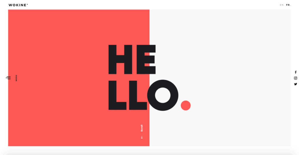
Minimalism in web design focuses on simplicity and functionality, emphasizing the essentials while eliminating any distractions. By prioritizing core elements, designers create a user-friendly experience that guides visitors seamlessly through the content. Key principles of minimalism include clarity, consistency, and balance. Clarity ensures that each component serves a purpose, while consistency in layout and design fosters familiarity and eases navigation. Balance is achieved by distributing elements evenly, creating visual harmony that enhances the overall aesthetic.
Implementing minimalism involves using a limited color palette, ample white space, and straightforward typography. White space helps to isolate key information, making it easier for users to digest content. A restricted color palette keeps the focus on important elements, reducing visual clutter. Additionally, opting for simple, clean fonts ensures that the text is legible and engaging. By understanding and applying these basic principles, designers can craft websites that not only look sleek but also provide a highly functional and enjoyable user experience.

The Benefits of White Space: Why Less is More in User Experience
White space, often referred to as negative space, is a critical element in user experience design that emphasizes the concept of 'less is more.' By strategically utilizing white space, designers can create visual breathing room that helps guide users' attention to the most important elements on a page. This uncluttered approach not only enhances readability but also improves the overall aesthetic of a website, making it more inviting. When users encounter a layout with ample white space, they can quickly process information without feeling overwhelmed, ultimately leading to a more enjoyable browsing experience.
Furthermore, white space plays an essential role in improving usability and accessibility. By clearly defining sections and separating content, users can navigate through a site with greater ease, reducing cognitive load and minimizing distractions. This allows for a more focused interaction with the content, which can significantly enhance user satisfaction. In today's fast-paced digital world, adopting a design philosophy that champions white space can set a website apart from competitors, helping to foster trust and encouraging users to engage more deeply with the content presented.
How to Effectively Simplify Your Website for Enhanced User Engagement
In today's fast-paced digital landscape, simplifying your website is essential for enhancing user engagement. A clean and intuitive design allows visitors to navigate your site effortlessly, reducing bounce rates and increasing the time spent on your pages. Start by prioritizing essential content; identify what information your audience finds most valuable and streamline your navigation to highlight those elements. Consider implementing a mobile-first design approach, ensuring that users on all devices have a seamless experience. This, coupled with a well-structured layout, can significantly improve usability.
Furthermore, utilizing visual hierarchy is crucial in guiding visitors through your content. Use clear headings and subheadings to break up text, and consider employing lists for information that can be easily digestible, such as:
- Key features of your products
- Frequently asked questions
- Important notices
Incorporate whitespace strategically to prevent overwhelming users with too much information at once. Lastly, remember to regularly gather user feedback to continue refining the user experience and adapt your website as needed, ensuring it remains a valuable resource.