Blitz News Digest
Stay updated with the latest trends and insights.
Color Your World: A Playful Dive into Website Color Schemes
Unlock the secrets of vibrant website color schemes and transform your online presence! Dive in for tips and inspiration that pop!
The Psychology of Color: How to Choose the Right Palette for Your Website
The psychology of color plays a crucial role in how users perceive your website and engages with the content. Different colors evoke distinct emotions and associations, which can significantly impact user experience and conversion rates. For example, blue often conveys trust and security, making it a popular choice for financial and healthcare websites, while red can create a sense of urgency, often used in clearance sales and call-to-action buttons. When selecting your palette, consider your target audience and the message you want to convey; doing so will help you choose colors that resonate with users on a psychological level.
To effectively choose the right color palette for your website, start by understanding the primary emotions you want to evoke. Create a mood board to visualize potential colors and combinations, making the selection process easier. Consider using the 60-30-10 rule when applying colors to your layout: allocate 60% of your site's primary color, 30% for a secondary color, and 10% for accent colors. Additionally, leverage tools like Adobe Color or Coolors to experiment with harmonious schemes, ensuring that your site's aesthetics align with its purpose and appeals to your audience.

Top 10 Trending Color Schemes for Modern Web Design
In the rapidly evolving world of web design, staying ahead of the trends is essential for creating visually appealing and functional websites. The top 10 trending color schemes for modern web design not only enhance aesthetics but also improve user experience by strategically guiding the viewer's eye and conveying brand identity. From muted earth tones to vibrant, energy-infused palettes, these color schemes can significantly impact website engagement and conversion rates. Below, we explore some of the most popular color combinations that designers are increasingly opting for in 2023.
- Pantone's Viva Magenta: A bold and dynamic shade, symbolizing vitality and strength.
- Muted Pastels: Soft hues like lavender and peach create a calm and inviting atmosphere.
- Neon Accents on Dark Backgrounds: This striking contrast is perfect for making essential elements pop.
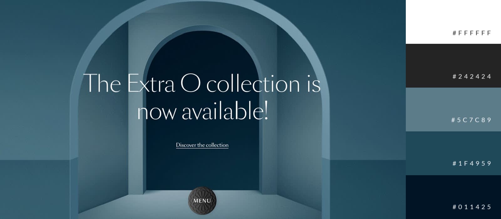
- Monochromatic Blues: Ideal for technology and finance sites, this scheme evokes trust and professionalism.
- Earthy Tones: Shades of green, brown, and beige promote sustainability and connection to nature.
- Minimalist Black and White: A classic choice for chic, modern brands, emphasizing simplicity.
- Warm Jewel Tones: Deep colors like emerald and ruby add richness and sophistication.
- Gradient Overlays: Smooth transitions between shades can create depth and interest.
- Vibrant Summer Colors: Bright colors like coral and turquoise keep things fresh and energetic.
- Metallic Accents: Gold and silver touches add a luxurious feel to any design.
How to Create a Harmonious Color Palette: Tips and Tools
Creating a harmonious color palette is essential for achieving a cohesive look in any design project, whether it be for digital graphics, interior design, or branding. To start, consider the color wheel as your best friend; it visually represents relationships between colors. For a harmonious palette, choose either analogous colors, which are next to each other on the wheel, or complementary colors, which are opposite each other. Using these relationships can help you strike the right balance, ensuring that your color choices enhance rather than clash with one another.
In addition to understanding color relationships, employing various tools can significantly ease the palette creation process. Websites like Adobe Color and Coolors allow you to experiment with color combinations and save your favorite palettes for future use. Don’t forget to test your colors in real-life applications, as lighting and material can affect how colors interact. Lastly, consider the emotion associated with colors; each hue can evoke specific feelings, so ensure your palette aligns with the message you want to communicate.