Blitz News Digest
Stay updated with the latest trends and insights.
Color Me Crazy: Choosing the Right Palette for Your Website
Unlock the secret to a stunning website! Discover tips for choosing the perfect color palette that captivates and converts visitors.
The Psychology of Color: How to Choose the Perfect Palette for Your Website
The psychology of color plays a crucial role in how users perceive your website. Different colors evoke different emotions, which can significantly influence user behavior and engagement. For instance, blue is often associated with trust and dependability, making it a popular choice for corporate websites. In contrast, colors like red can create a sense of urgency, which may be effective for sales pages. Understanding the emotional impact of each color can help you create a perfect palette that resonates with your target audience and encourages desired actions.
When choosing a color palette for your website, consider the following tips:
- Identify your brand personality: Choose colors that align with your brand values and the message you want to convey.
- Test combinations: Use online tools to visualize how different colors work together and select those that complement each other without overwhelming the user.
- Consider readability: Ensure that text is easy to read by maintaining a strong contrast between background and font colors.

Top 5 Color Palettes to Boost Your Website's Aesthetic Appeal
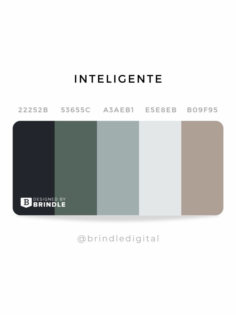
Choosing the right color palette is crucial for creating a visually appealing website that captures the attention of your audience. Color palettes not only influence the aesthetic appeal of your site, but they also play a significant role in enhancing user experience and brand recognition. Here are the top 5 color palettes that can elevate your website's design and make it more engaging:
- Monochromatic Blues: This palette exudes tranquility and professionalism, making it ideal for corporate and financial websites.
- Warm Neutrals: Soft beige, taupe, and cream create a cozy atmosphere, perfect for lifestyle and wellness blogs.
- Bold Contrasts: Pairing vibrant colors like red and teal not only grabs attention but can also drive action on e-commerce platforms.
- Pastel Hues: Gentle tones like mint green and lavender evoke a sense of playfulness, making them suitable for children’s products or creative ventures.
- Earthy Tones: Shades of browns and greens connect with nature, ideal for eco-friendly or outdoor adventure websites.
Is Your Website Losing Visitors? Discover the Impact of Color on User Experience
Are you noticing a decline in your website traffic? It's time to take a closer look at your site's design elements, particularly the color palette. Research shows that color can significantly influence user behavior and perception. For instance, a well-chosen color scheme can evoke emotions, guide users' attention, and even affect their decision-making processes. Does your site use colors that resonate with your target audience? Analyzing the psychological implications of color can help you create a more engaging user experience that keeps visitors coming back.
Furthermore, the impact of color goes beyond aesthetic appeal; it plays a crucial role in usability and user experience. According to various studies, users make rapid judgments about a website's credibility based on its color scheme. A site that uses clashing colors or an unappealing layout may cause potential visitors to leave almost instantly. Consider conducting A/B testing to explore how changing color elements can affect your site's bounce rate and overall visitor engagement. Remember, subtle changes in color can lead to significant improvements in user retention and satisfaction.