Blitz News Digest
Stay updated with the latest trends and insights.
Color Your World: The Secret Language of Website Color Schemes
Discover how color schemes can transform your website! Unlock the secrets of vibrant design and engage your audience like never before!
Understanding the Psychology of Color in Web Design
The psychology of color plays a critical role in web design, influencing how users perceive a brand and interact with a website. Each color evokes certain emotions and associations; for instance, blue often conveys trust and professionalism, making it a popular choice for corporate websites. On the other hand, vibrant colors like red can instill a sense of urgency, which is why they are frequently used in call-to-action buttons. When designing a website, it's essential to consider the target audience and the message you want to communicate, as the colors you choose can significantly affect user experience and engagement.
To effectively leverage the psychology of color, designers should start by identifying the primary goals of the website. Are you aiming to inspire creativity, establish trust, or evoke excitement? This will guide your color palette selection. Additionally, incorporating contrast and harmony in your designs can enhance readability and aesthetic appeal. Remember, colors not only represent brands; they also facilitate navigation and help convey the brand’s identity. By thoughtfully applying the principles of color psychology, web designers can create visually appealing sites that resonate with visitors on a deeper emotional level.

Top 10 Color Schemes That Enhance User Experience
Choosing the right color scheme is crucial for enhancing user experience on any website. A well-thought-out color palette not only captures the attention of users but also communicates the brand's message effectively. In this article, we'll explore the top 10 color schemes that can significantly improve user engagement and usability. Each color scheme has its unique psychological impact, making it essential to choose one that resonates with your audience. For instance, blues and greens often evoke feelings of trust and calm, while vibrant reds and yellows can create a sense of urgency or excitement.
- Monochromatic: Using varying shades of a single color creates a soothing and harmonious effect.
- Complementary: This scheme pairs colors opposite each other on the color wheel, enhancing visibility and interest.
- Analogous: Combining colors that are next to each other promotes harmony and coherence.
- Triadic: Utilizing three colors equally spaced on the color wheel generates vibrant and dynamic visuals.
- Pastel Colors: Soft, muted colors offer a gentle aesthetic that can enhance the user experience.
- Neutral Tones: Incorporating grays, whites, and blacks can create a clean and minimalist design.
- Warm Colors: Reds, oranges, and yellows can invoke feelings of warmth and energy, great for engaging content.
- Cool Colors: Blues, greens, and purples can generate a sense of peace, often suitable for tech and healthcare interfaces.
- Earthy Tones: Browns, greens, and ochres connect users to nature, promoting sustainability.
- Bold and Bright: Vibrant colors grab attention and can effectively highlight call-to-action buttons.
How to Choose the Perfect Color Palette for Your Website
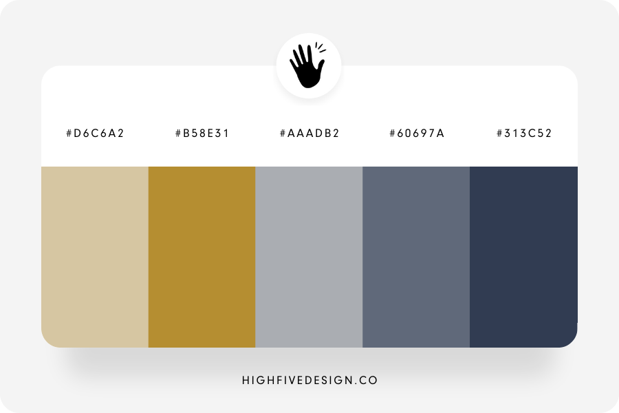
Choosing the perfect color palette for your website is crucial as it sets the tone and enhances user experience. Start by understanding your brand's identity and the emotions you want to evoke. Consider creating a mood board that showcases colors related to your industry. Utilize color theory to ensure that your palette is harmonious and appealing. Remember to limit your primary colors to three to five shades to maintain visual coherence and avoid overwhelming your visitors.
Once you've determined your primary colors, think about incorporating accent colors that complement your main palette. Use these accents sparingly for buttons or highlights to draw attention without distracting from your content. Additionally, pay attention to accessibility by ensuring sufficient contrast between text and background colors, making your site accessible to all users. By following these guidelines, you can effectively choose a color palette that not only reflects your brand but also enhances the overall user experience.