Blitz News Digest
Stay updated with the latest trends and insights.
Color Your World: How to Paint Your Website's Personality
Transform your website's vibe! Discover tips to unleash a colorful personality that captivates and converts visitors.
The Psychology of Color: Choosing the Right Palette for Your Website
The psychology of color plays a crucial role in web design, influencing user behavior and perception. Colors evoke emotions, set the tone for your brand, and can even dictate the effectiveness of your website's calls to action. For instance, blue often instills feelings of trust and security, making it an excellent choice for financial or healthcare websites. On the other hand, vibrant colors like red can create a sense of urgency, perfect for sales or promotions. Understanding the meanings behind different colors can help you select a palette that aligns with your goals and resonates with your target audience.
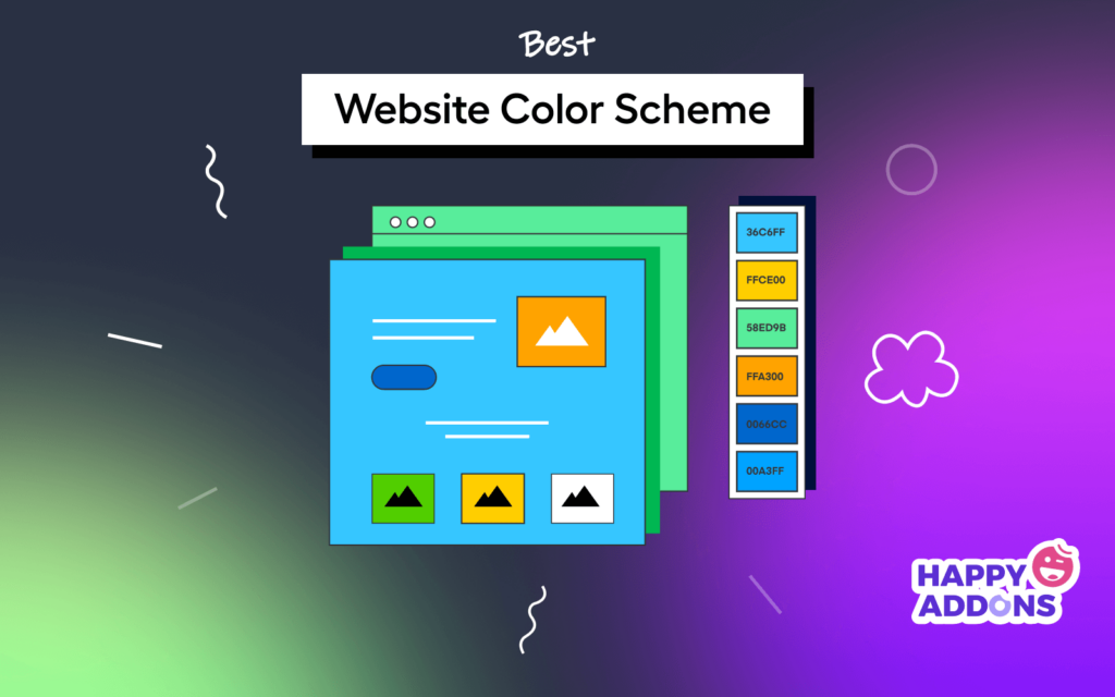
When choosing the right color palette for your website, consider creating a color scheme that incorporates both primary and accent colors. A typical approach is to establish a dominant color that reflects your brand identity, followed by one or two secondary colors that complement it. You may also want to experiment with shades and tints to create depth and visual interest. Remember, consistency is key; using your chosen color palette across all platforms not only solidifies your brand image but also enhances overall user experience.

10 Tips for Infusing Your Website with Personality Through Color
Choosing the right colors for your website is an essential step in establishing a unique brand identity. Using a limited color palette can help define the personality of your site. Consider incorporating complementary colors to create visual interest while keeping your design cohesive. Start with a base color that reflects your brand's ethos, and then select a few accent colors that enhance the overall feel of the site. For example, a vibrant orange can evoke feelings of energy and enthusiasm, making it perfect for creative businesses, while a soft blue can convey trust and reliability, ideal for corporations and professional services.
Beyond basic color selection, contrast plays a vital role in infusing personality into your design. Utilizing high contrast between background and text colors ensures that your content remains readable and engaging. Additionally, think about the emotional effects of the colors you select; warm colors like red and yellow are known to stimulate excitement, while cooler shades like green and purple can evoke calmness and serenity. A well-balanced use of color psychology ensures visitors not only enjoy their experience on your website but also feel a connection to your brand's personality. Remember to test different combinations and gather feedback to find the perfect mix!
How Color Choices Impact User Experience and Engagement
The choice of color in web design plays a pivotal role in shaping user experience and engagement. Colors evoke emotions and can influence the perception of a brand or product. For instance, warm colors like red and orange can create feelings of excitement or urgency, making them ideal for calls to action, whereas cooler colors like blue and green can instill a sense of trust and calmness. Therefore, selecting the right color palette is essential for ensuring that users feel the desired emotion that aligns with your content’s objectives.
Moreover, accessibility should also be a consideration when making color choices. Ensuring that there is sufficient contrast between text and background colors is crucial for readability, particularly for users with visual impairments. Implementing a color scheme that accommodates all users enhances overall engagement and satisfaction. By taking the time to analyze and implement effective color strategies, businesses can significantly improve their audience interaction and make their website more appealing.